
Marathon menus divide players as Bungie invites UI feedback
Last week one of the most circulated reactions to the Marathon server slam came from a YouTuber who, after one look at the menus, called it the first ever "fontslop" game. He wasn't alone; many players said their eyes were assaulted by Marathon's unorthodox graphic design.
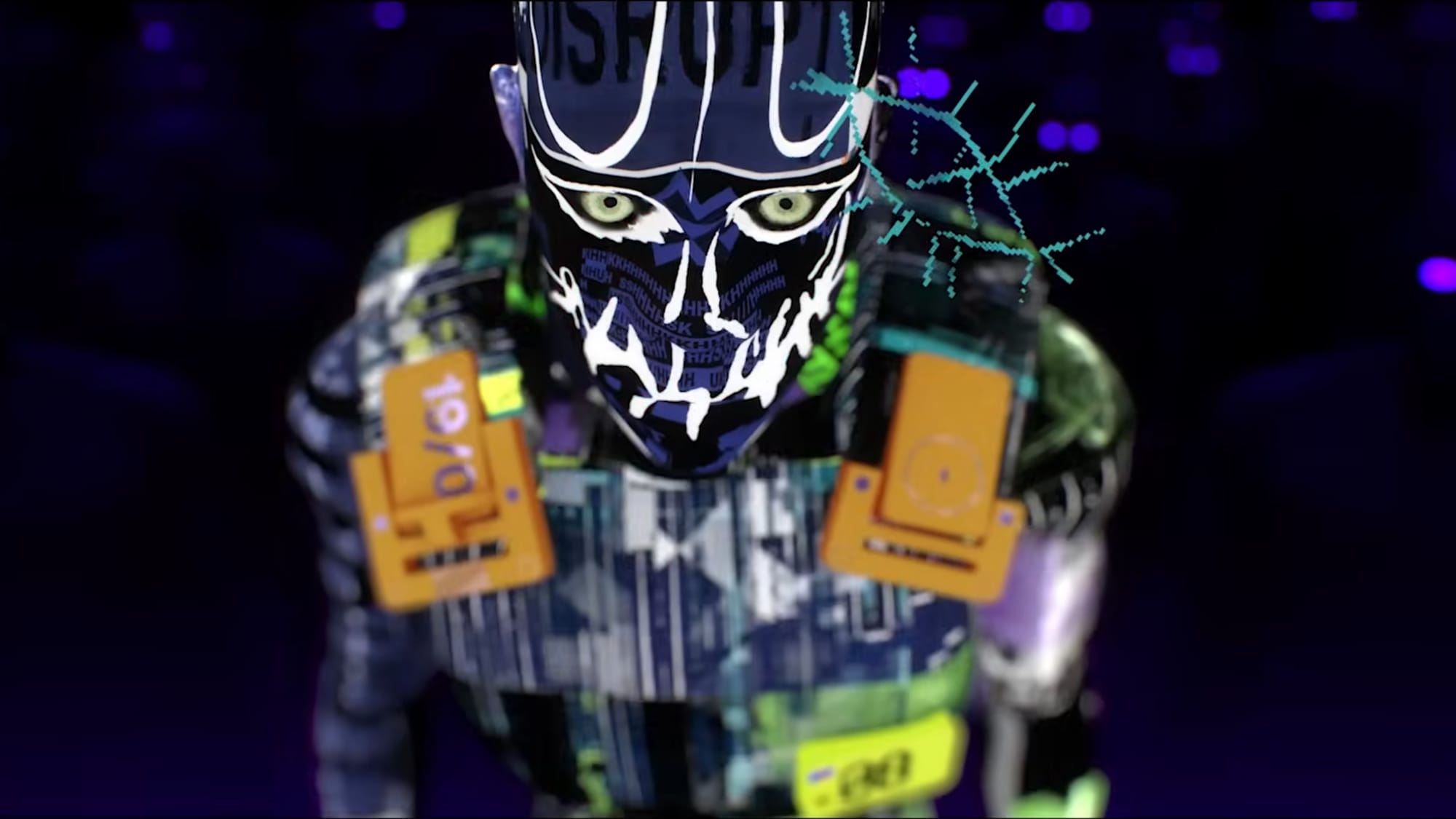
UI feedback was one of Bungie's major takeaways from the weekend server slam, and the Bungie account on X invited more comments with "Keep it coming." The interface has clear practical issues—inventory sorting icons are too similar, tracking items is frustrating, and using the Codex requires too many clicks—yet it also looks breathtaking.
I reckon the extreme reaction stems in part from a decade-plus where the art of graphic design has been sapped out of big-budget games, especially multiplayer shooters; everything instantly recognizable became the norm, and gamers aren't used to seasoning their food.
marathon, bungie, ui feedback, menus, fontslop, graphic design, inventory sorting, codex, server slam, youtuber